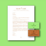
Licell Logo & Brand
This project breaks boundaries by pushing beyond traditional clichés with a new age logo that uniquely represents this forward-thinking renewable energy company.
Licell is an ethanol fuel company that is focused on advancing its methods of producing ethanol in order to reduce its negative impact on the environment. Currently, the company uses a traditional method of producing ethanol from corn by using a starch-based process; however, it is also researching and refining a newer method which is based on the cellulose structures of switchgrass, corn stalks & tree bark. Upon refining this process, Licell has plans to implement this method into its own production cycle.
The process of producing ethanol completes a cycle. It is this process which inspired the concept behind the logo for Licell. The predominately curvilinear shapes reference the process, while the semi-rectilinear typeface is meant to create a contrast between the icon and the type. The Licell icon is an abstraction of the Switchgrass plant since this plant is the primary one used in the research for new ways of producing ethanol. This plant was also chosen over others because it is meant to act as a symbol of the future, which is appropriate for this forward-thinking company.